SAAS E-commerce Admin Dashboard — Light & Dark Modes
A Sleek & Intuitive SaaS Dashboard for E-Commerce Management
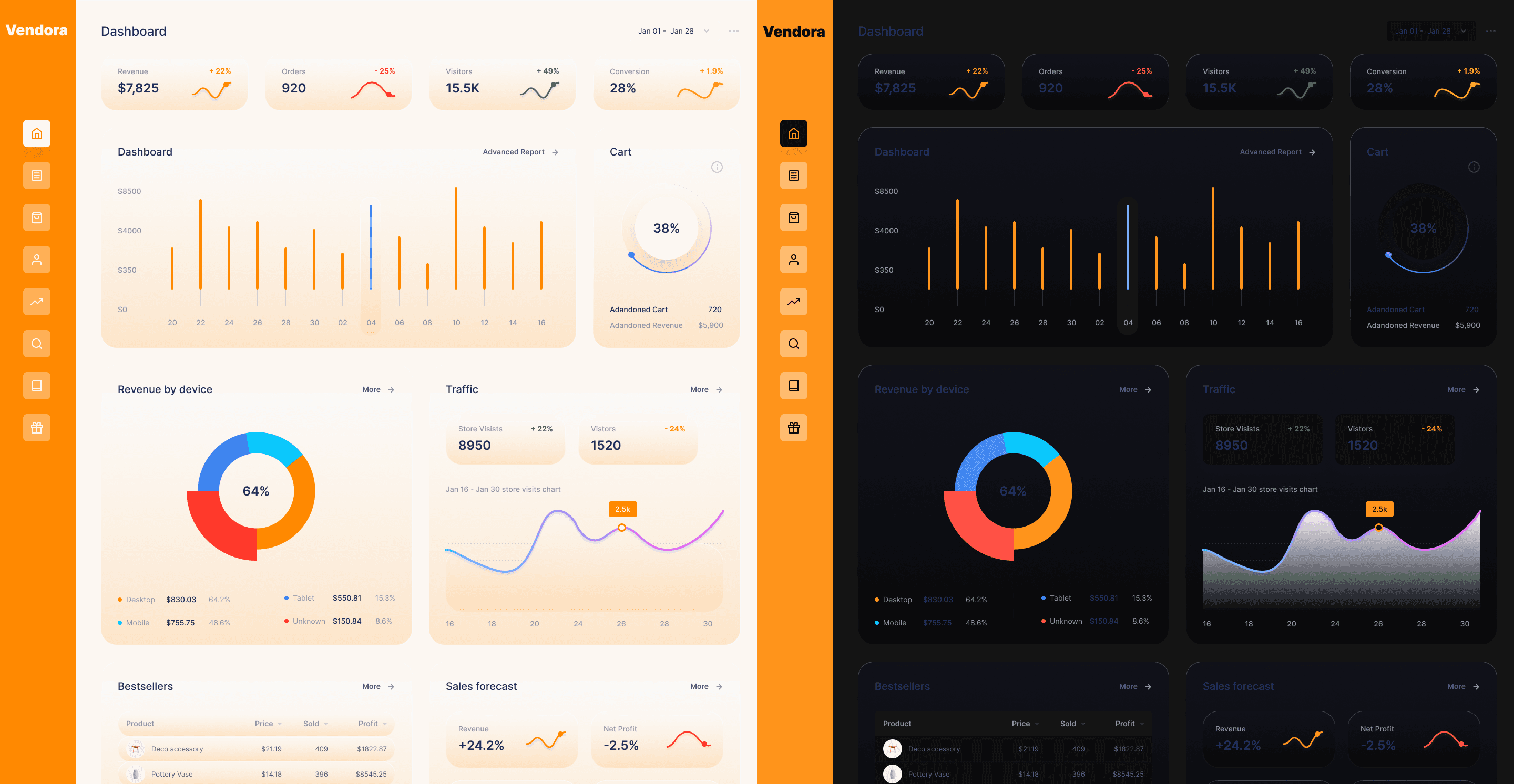

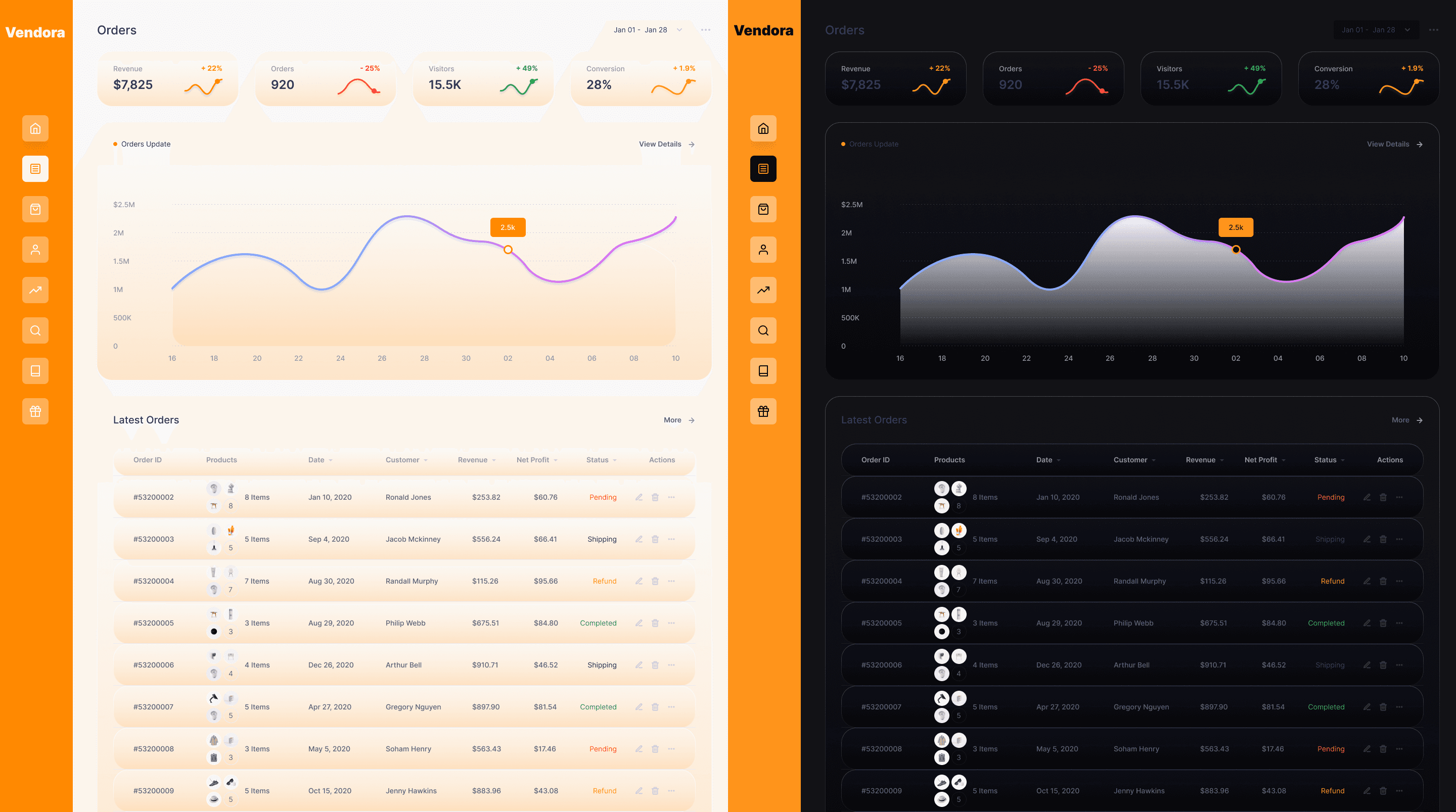
A sleek and responsive admin dashboard designed to help store owners manage orders, products, and analytics with ease. This project explored both light and dark themes, ensuring visual clarity, accessibility, and a modern UI aesthetic.
Timeline
2 weeks
Background
Create a dual-mode e-commerce dashboard that’s intuitive, visually consistent, and delightful to use.
This category details the step-by-step approach taken during the project, including research, planning, design, styling phases.
Research & Planning
I explored dashboard UI/UX patterns across leading SaaS platforms to understand how e-commerce managers track sales, inventory, and orders efficiently. This helped shape a clear feature list.
Prototyping & UX Polishing
Interactive prototypes were built in Figma to test flow and layout responsiveness. I paid extra attention to color contrast, icon clarity, and spacing consistency.
Visual Design – Light & Dark Modes
I designed both modes to reflect a modern, calm aesthetic: light mode feels fresh and clean, while dark mode adds focus and elegance for low-light workflows.
The final dashboard design offers a modern, flexible workspace with clean visual hierarchy, soft contrasts, and smooth toggling between light and dark modes.
Dual Theme Design
The dashboard supports both light and dark modes, offering flexibility for users to choose a viewing experience that suits their environment and preference. This improves readability and reduces eye strain.
Clean, Modular Layout
With clearly structured sections, consistent typography, and intuitive filters, the dashboard simplifies data navigation and product management. It balances aesthetics with function, making complex tasks feel seamless.
This section highlights key outcomes from improved design efficiency, cleaner UI and portfolio polish.
Improved Design Efficiency
Designed both dark and light modes while maintaining consistency and usability.
Refined SaaS UI Skills
Practiced creating data-heavy layouts that feel clean, calm, and easy to scan.
Strong Visual Outcome
The final prototype is polished and portfolio-ready showcasing my ability to handle multi-mode interfaces with good hierarchy and style.