E-commerce skin care website
A Natural Skincare E-Commerce Experience


This concept blends soft typography, earthy colors like sage green and cream, and generous spacing to help products stand out without feeling overwhelming. From homepage to product detail, every page was designed with intentional calm and simplicity.
Timeline
1 week (solo project)
Background
Bloom Skin was born from a desire to create a skincare shopping experience that feels as natural and calming as the products themselves. The challenge was to design a clean, product-forward site that conveys trust, ease, and warmth all while maintaining high usability across devices.
This concept blends soft typography, earthy colors like sage green and cream, and generous spacing to help products stand out without feeling overwhelming. From homepage to product detail, every page was designed with intentional calm and simplicity.
This category details the step-by-step approach taken during the project, including research, planning, design, development, testing, and optimization phases.
Research & Planning
I explored the online presence of clean skincare brands to understand layout trends, customer expectations, and effective storytelling in the wellness space. I also noted how earthy brands use whitespace, tone, and soft imagery to feel calming and credible.
Design & Prototyping
Inspired by nature, I created a soothing visual system using tones like #EEEAE1 and #5C7676. I designed the homepage, product pages, and interactions with clear CTAs, airy spacing, and gentle animations. The focus was clarity and calm, not overwhelming users.
Implementation
Using Figma, I built a high-fidelity prototype that’s fully scrollable and responsive. Design decisions were rooted in user flow making it easy to browse, read ingredient details, and add to cart without friction.
Testing & Optimization
After getting peer feedback, I adjusted typography for better legibility and refined the product card spacing. Final tweaks emphasized hierarchy and simplified the navigation bar for a more focused mobile experience.
Designing with intention Bloom Skin combines thoughtful visuals with practical UX, creating a calm, conversion-friendly shopping journey from product to checkout. Key features include:
Clean, guided cart flow
The cart page is built for clarity: large visuals, quantity controls, and a minimalist layout make reviewing items feel simple and pleasant. Key info like price, shipping, and totals are organized into a soft-bordered panel, reducing cognitive load and adding visual separation.
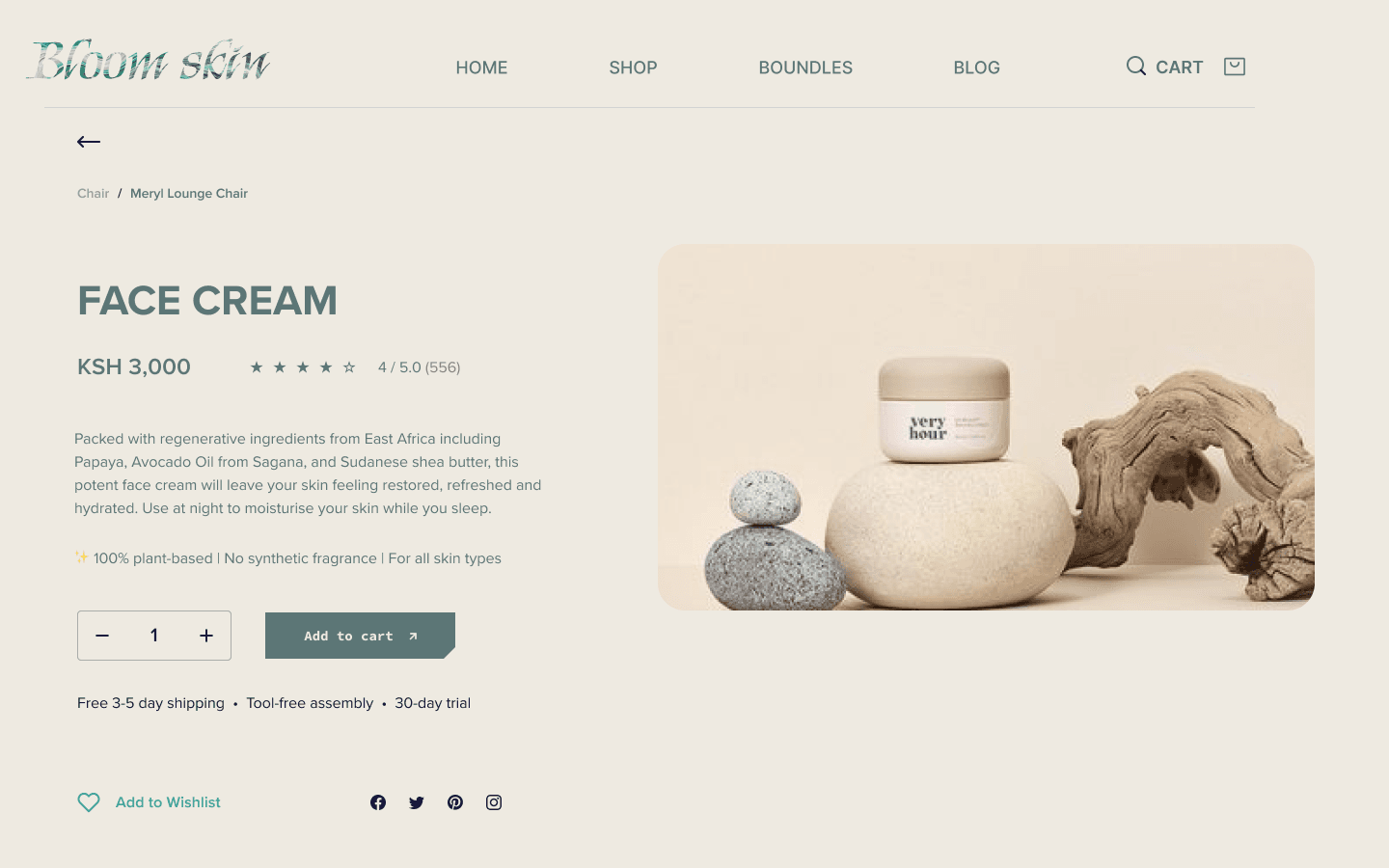
Clean product summary layout
Each item is displayed with generous spacing, large imagery, and minimalist controls. This layout emphasizes clarity while letting the product speak for itself.

Here, the outcomes and achievements of the project are highlighted, including user feedback, adoption rates, and industry recognition.
increased visual clarity
Users report significant time savings and improved productivity through optimized scheduling recommendations.
Positive peer feedback
By removing visual noise and using intentional whitespace, the site feels more breathable and focused allowing products and pricing to shine without distraction.
Portfolio-ready prototype
The final prototype is a responsive, scroll-friendly concept that reflects your brand voice and showcases your ability to design for both aesthetics and usability in e-commerce.