Real estate platform
A Calm & Inviting Home Design Experience


This was a personal design challenge to explore UI layouts for a modern, soft-themed home services website. The goal was to create a welcoming and elegant experience for users exploring home design solutions with a clear, user-friendly layout and cohesive visual identity.
Timeline
From concept to final design 2 weeks. Designed alongside other portfolio projects.
Background
With an increasing interest in intuitive and visually soft digital experiences, I wanted to explore how a home design website could feel more approachable, calming, and trustworthy. The concept was born from my curiosity about blending minimal UI with warmth using soft palettes, rounded layouts, and gentle interactions.
This self-initiated project allowed me to experiment with aesthetic direction and structure, while keeping usability and hierarchy clear for potential users browsing home design inspiration or services.
This category details the step-by-step approach taken during the project, including research, planning, design, styling phases.
Research & Planning
I began by collecting visual references and studying modern interior design trends. My goal was to create a space that felt calming, clean, and livable with a blend of soft neutrals and gentle textures.
Sketching & Layout Planning
Using Figma, I drafted initial floor plan ideas and tested furniture arrangements to find the right spatial flow. I paid attention to proportions, balance, and visual harmony.
Styling & Detailing
Once the layout felt right, I added color palettes, textures, and decor elements. I focused on subtle contrasts, curved shapes, and cohesive accent pieces to create a welcoming vibe.
The final design reflects a calm, cohesive space with soft neutral tones, subtle color pops, and modern, functional pieces.
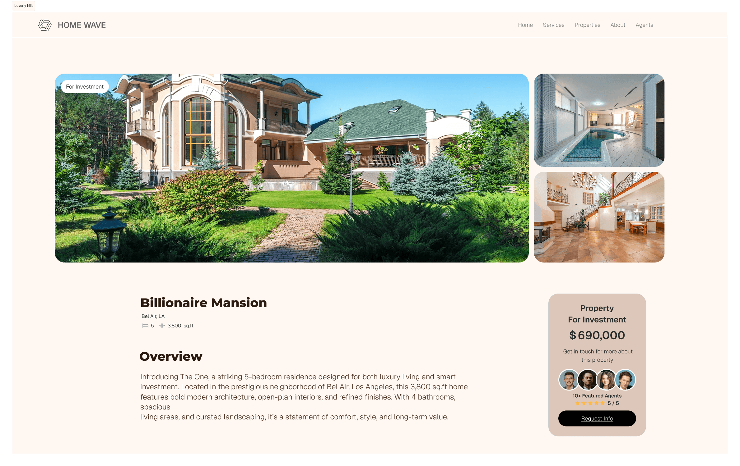
Elegant Property Detail Layout
Each property page presents information in a calm, structured way. By combining large hero images, clear pricing, agent info, and a clean amenity breakdown, users can digest key details without feeling overwhelmed.
Integrated Contact & Trust Cues
The contact section reinforces trust with real agent photos, a clear call-to-action, and a frictionless form. It feels personal, warm, and professional matching the tone of luxury real estate.
Balanced Aesthetic & UX
Typography, padding, and visual hierarchy are carefully tuned for a soft yet sophisticated brand feel. The layout guides users naturally through each section, blending editorial design with usability.

This section highlights the key wins of the project from peer appreciation and improved usability to increased engagement and aesthetic appeal.
Increased Efficiency
The modular layout and structured content made it easier to present real estate offerings without overwhelming users. Navigation felt fluid and focused, reducing visual clutter.
Positive Peer Feedback
The design received praise for its clean layout, balanced white space, and premium visual tone especially the way listings and services were presented with elegance and clarity.
Growing User Appeal
The aesthetic and layout choices reflected a modern lifestyle brand making the site more attractive to both real estate professionals and design-conscious users.